Design
A Strangely Isolated Place
a blog and record label for ambient and electronica artists
A bold, iconic logo
for Ryan Griffin’s inspiring project.
A clean symbol that blends the concepts of place, isolation and context.
Simple, versatile and easily adaptable to any application.
ASIP Logo
Full-name variant.
My work on A Strangely Isolated Place
I was responsible for the design of the ASIP logo and iOS app icon.
In Ryan Griffin’s words, “My brief to him wasn’t an easy one, but he nailed it.”.
Finished artwork
ASIP logo
Different sizes and variants.
ASIP iOS icon
Different sizes, retina-ready.
ASIP Logo In The Wild
The ASIP logo was designed to be effective across a wide range of applications.
Its simple design makes it instantly recognizable at any size, in any context.
Some examples of how it’s being used
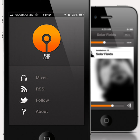
iPhone App
by @madebyhive.
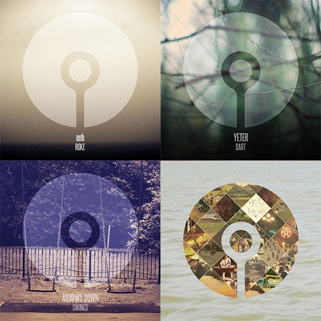
Cover Art
by @asip.
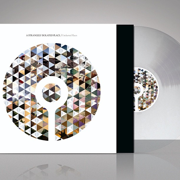
Vinyl
by Glassup & Stoski.
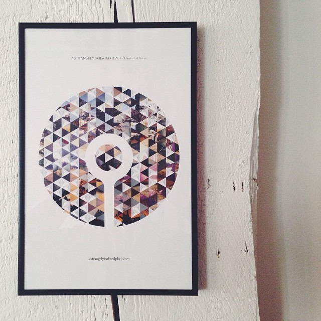
Poster
by Glassup & Stoski.
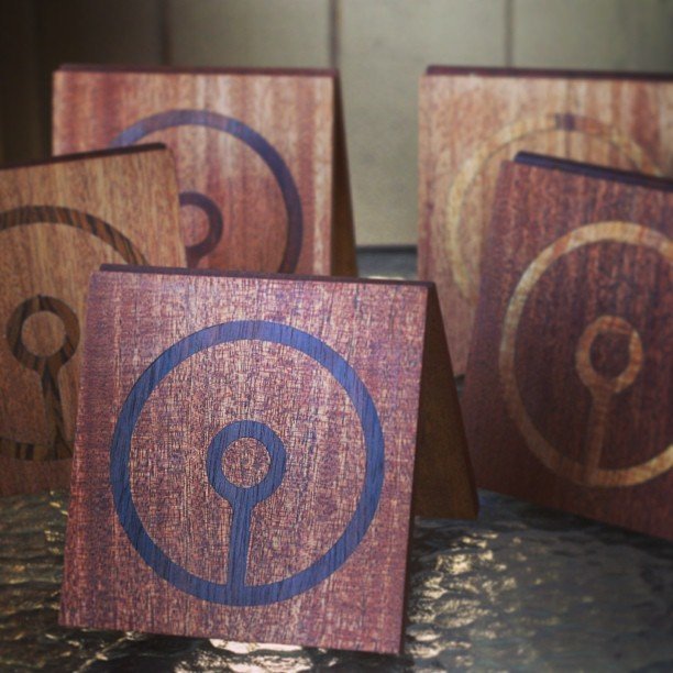
Wooden CD Cases
by @kaginawa.

T-shirt
by @asip.
Colophon
The logo was designed in mid 2012.
You can follow ASIP on astrangelyisolatedplace.com
Skills and Tools
These are the skills and tools I used throughout this project.
Design
The logo was designed in Adobe Illustrator, with the help of Astute Graphic’s SubScribe plugin for drawing tangent curves. The color, subtle effects and iOS icons were applied in Adobe Photoshop.